I was doing some research earlier and came across the Ariel website, I’m wondering if it’s normal for me to think their current home page is pretty disturbing.
Let’s look at this step by step:
- Ariel is a washing liquid/powder and is classically branded in blue and green, because it’s so clean, fresh and obviously feels/smells like the sea/sky/nature/apples/limes/etc.
- Way too many people in the world don’t have enough or any clean drinking water, which is definitely a huge issue and Ariel seems to want to get involved. I guess the relevance can be debated, but it’s a noble cause, so why not.
- However little clean drinking water you have, drinking detergent is not good for you.
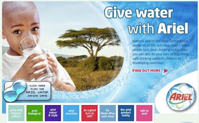
So here we have a the pic of a kid in Africa basically appearing in a washing machine (animated blue bubbles going in a circle, pic shows up in the middle). Ariel branded, blue like no water has ever been before but interestingly the same colour as the Ariel liquid you can find at your local supermarket – or maybe same as a swimming pool. And the kid is drinking it.
Wrong.
No..?

classic case of client playing creative, by asking for typical imagery, i.e. malnourished african kid, glass of water, brand logo swirls, etc. tsk tsk tsk…
it doesn’t help that the brand is a detergent, and their socio-civic cause is clean drinking water both of which are potentially incongruent, and aggravated by this layout done in bad taste, pun unintended.
I totally agree Nadja. I really dislike the imagery there – looks like they are doing a ‘Chinese Olympics’ by putting a cute kid on their homepage… and yup the water looks fake… Photoshop gone wrong?
Photoshop probably didn’t go wrong, I xpect the client asked for a bluer than blue sort of colour ;o)